iPhone 18 Pro: Smaller Dynamic Island, More Uniform Back, New Colors – What the Leaks Indicate
Apple appears to have no intention of undertaking a major visual overhaul in 2026. With the iPhone 18 Pro and iPhone 18 Pro Max set to launch in the fall, leaks suggest a more typical approach from Cupertino: tightening, smoothing, and harmonizing—saving any significant changes for a later date.
A Smaller Dynamic Island: Prioritizing Cleanliness Over Spectacle
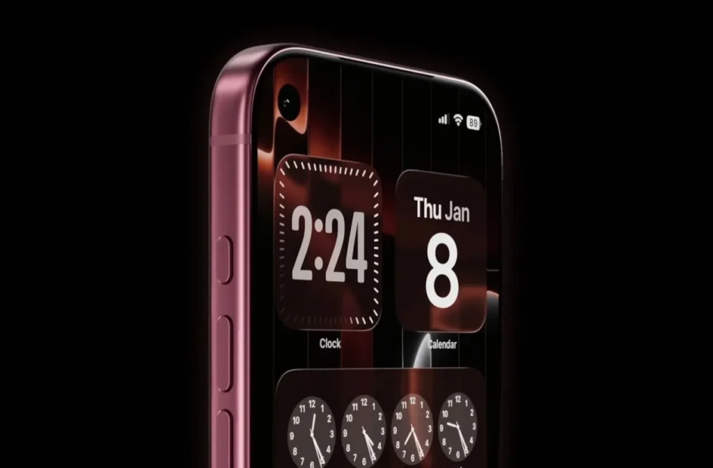
The most noticeable change will likely be on the front: a reduced Dynamic Island, though not eliminated. Leaker Ice Universe mentions that the component could be approximately 35% narrower, shrinking from about 20.7 mm to roughly 13.5 mm in width.
This alteration is not merely cosmetic: several rumors suggest it could be tied to a partial relocation of Face ID components beneath the screen (without fully transitioning to a “full under-display” design). In essence, Apple seems to be working on reducing the cutout gradually rather than eliminating it outright, ensuring reliability and calibration remain intact.
Apple is “decluttering” the front and looking towards the future. The Dynamic Island, having become a signature feature, remains an important UX marker—but now it appears less intrusive and more of a “technical gem” than a flaw.
The Glass and Aluminum Back Remains, but Apple Aims to Eliminate the Two-Tone Effect
The second adjustment is that the back, introduced in the previous generation (with its camera plateau and glass/aluminum assembly), will be retained, but with a focus on reducing the color difference between materials to create a more uniform appearance.
This change makes sense. The “two-tone” design has been divisive: some appreciate the industrial look, while others find it less reflective of Apple’s monolithic style. Harmonizing colors is a straightforward way to maintain the structure (and its design advantages) while addressing premium perception.
Apple is not overhauling the recipe; it is simply adjusting the seasoning. When the overall shape is set to optimize production lines, perception relies heavily on finishing details.
Bolder Colors: The Pro Finally Gains a Personality
The third indication is that the Pro color palette may continue to expand. MacRumors has reported that colors like Coffee/Brown, Purple, and Burgundy are being tested as potential “special” options.
This is not inconsequential. Color has emerged as one of the few “emotional” levers available when design innovations are no longer dramatic year after year. On the Pro line, where serious tones (black, gray, silver) have dominated, a bold hue serves as a social signal: “Yes, this is the high-end model—and it shows.”
The Pro model also sells on desire. And in 2026, that desire may stem more from a well-chosen shade than from a fraction of a millimeter difference.
Apple Prepares for the Future Without Disrupting the Present
Taken together, these hints outline a coherent philosophy: refinement + transition. Apple is moving towards a more “all-screen” look (by reducing the cutout), stabilizing a more complex back (by enhancing visual consistency), and revitalizing the Pro (through color).
The implicit message is clear: the iPhone has transitioned away from an era of annual revolutions to one of continuous optimization—where each generation also serves to prepare for the next.