Google Chrome changes its appearance: Why switch to vertical tabs?
It took years of resistance and the quiet pressure from next-generation browsers for Google to finally evolve one of the most visible aspects of Chrome.
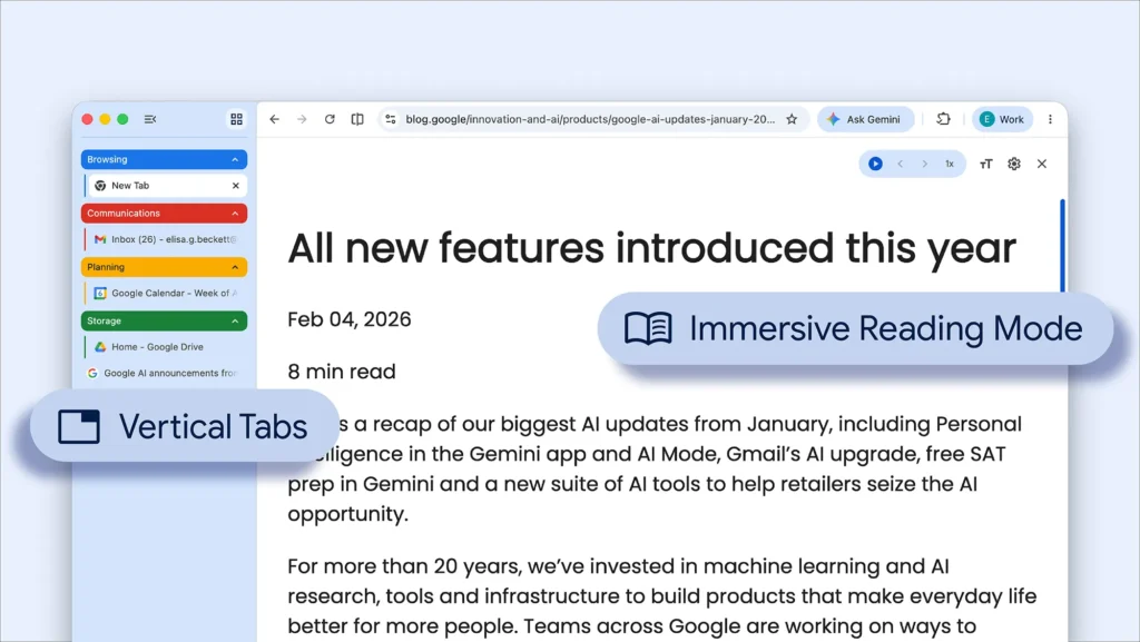
The company is now rolling out vertical tabs, accompanied by a new full-screen Reading Mode, two additions that highlight how the world’s most used browser is responding to increasingly creative competition.
Chrome: A simple feature, but highly symbolic
In Chrome, tabs can now be switched to the side of the window with a right-click followed by the option “Show tabs vertically.” Once activated, this layout becomes the default mode until the user decides to revert it. Google also notes that vertical tabs maintain the classic behavior of Chrome, with separate windows, their own tab groups, and, in practice, the only real limit being the machine’s hardware resources.
On paper, this seems like a simple interface adjustment. In reality, it represents a significant shift. Vertical tabs address a very concrete need for power users: better reading of full titles, easier differentiation between multiple pages from the same site, and reduced visual clutter when dozens of tabs accumulate.
This type of use has contributed to the popularity of this approach in browsers like Arc.
Google is not just following its habits, but also the market
What makes this announcement interesting is not just the feature itself, but what it reveals. Chrome had experimented with side tabs several years ago without progressing to a public rollout. This time, Google is formalizing the feature, even as newer browsers have built part of their identity around a more flexible, modular interface better suited for multitasking.
Implicitly, Google recognizes that some browser innovation is no longer solely coming from Chrome. Arc has brought vertical tabs back into the product conversation, and the emergence of AI-enhanced browsers has intensified competitive pressure. Google’s decision seems less like a trend and more like an upgrade that has become difficult to avoid.
A rethought reading mode for a saturated web
Google is also launching a new version of Reading Mode, now designed as a full-screen experience. The goal is clear: to eliminate visual noise, reduce page clutter, and refocus attention on the text. Google presents this version as the new default experience for Reading Mode in Chrome.
The timing is not coincidental. As many web pages—particularly in the media—become cluttered with banners, pop-ups, autoplay videos, and subscription requests, a more immersive reading mode is becoming almost a survival tool. There’s a subtle irony here: Google is improving the reading experience of a web that is partly suffering from the economic upheavals in traffic and online visibility.
Chrome enters a more offensive phase
These new features are part of a broader trend. In recent months, Google has rolled out several updates to Chrome, including the integration of Gemini, autofill improvements, a Shared View mode, and even an accelerated release schedule for the browser. Vertical tabs are not an isolated addition; they are part of a more visible strategy of product modernization.
Ultimately, this update tells a very simple story: Chrome is no longer in a position to ignore good ideas coming from elsewhere. When a dominant browser finally adopts a long-requested feature, it’s not just an ergonomic victory.
It also signifies that the browser war has become a bit more interesting.