ColorOS 17: OPPO prioritizes user experience over a Liquid Glass redesign
While various Android manufacturers are drawn to glass-inspired interfaces and immersive visual effects, OPPO is taking a different approach.
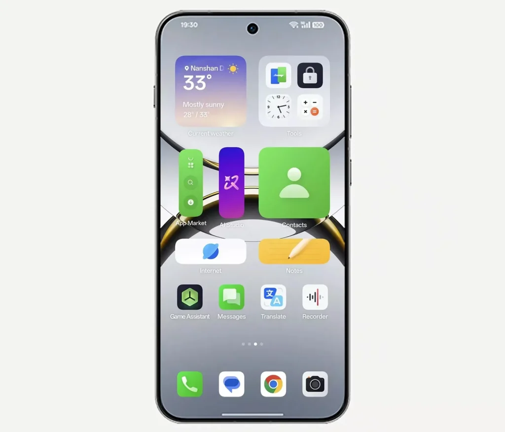
According to the latest statements from the ColorOS design team, the upcoming version of the system, known as ColorOS 17, will prioritize user experience and optimizations rather than a dramatic aesthetic overhaul.
This choice could set OPPO apart as the industry sees a surge in visual experimentation.
Rumors Suggested a More Spectacular Interface
The discussion began with several leaks from renowned informant Digital Chat Station. According to these reports, a future Android interface named “C17” was expected to introduce:
- A design further inspired by glass
- More uniform corners throughout the interface
- New dynamic light effects
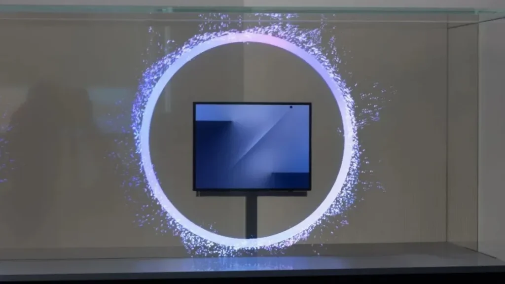
- An interaction model based on a Light Field system
- Intelligent color adaptation using AI
- Visual materials simulating glass
This description clearly pointed to the current trend towards more immersive and three-dimensional interfaces.
OPPO Calms Expectations

In response to speculation linking these features to ColorOS 17, Chen Xi, the design director of ColorOS, sought to clarify the situation. He indicated that the descriptions shared likely do not pertain to OPPO’s upcoming system.
Chen Xi noted that the confusion emanates from the term “Light Field,” which has been a part of ColorOS’s design philosophy for several years.
Interestingly, he mentioned that another Android manufacturer is currently working on a much bolder “Liquid Glass” design approach.
User Experience Before Visual Effects
OPPO appears to be adopting a more pragmatic direction. According to the design chief, ColorOS 17 will primarily focus on optimizing performance, enhancing overall system fluidity, improving daily usage, refining existing interactions, and ensuring a more coherent user experience.
In other words, OPPO prefers to perfect the foundations rather than proliferate graphical effects.
This strategy stands in contrast to some competitors who are trying to align Android with new, heavily animated interfaces recently popularized in the industry.
A Strategic Choice in a Mature Market
This stance is not trivial. Currently, high-end Android interfaces are at a very advanced level of maturity. The most tangible benefits for users are no longer exclusively aesthetic but come from speed, battery life, or intelligent software.
OPPO seems to recognize that while a spectacular animation may impress during a presentation, better memory management or smoother navigation is what users tend to value more over the long term.
Launch Expected in September
ColorOS 17 is expected to be officially unveiled in China this September alongside the upcoming OPPO Find X10 series. The rollout to other compatible smartphones will follow gradually.
Even without any announced graphical revolution, this new version could represent a significant milestone for OPPO if the promised optimizations lead to a noticeable improvement in user comfort.
In a market where many manufacturers are striving for visual impact, OPPO is seemingly making a more discreet—yet potentially more relevant—bet on efficiency.